What Are Pictographs?
Picture graphs, also known as pictographs, are visual representations of data using pictures or symbols to represent quantities, data, or information.
Picture graphs offer a visually engaging way to present and understand data, making it easier to identify patterns, compare quantities, and draw conclusions. Visual representation of any collected data makes understanding and evaluating the information simpler. Instead of long lists of numbers, a single graph can tell us important insights about the data more conveniently.
Each picture or symbol represents a certain quantity or value in a picture graph. Picture graphs are commonly used to display categorical data or data that can be easily represented by visual symbols.
The symbols used in picture graphs can vary depending on the context and the represented data.
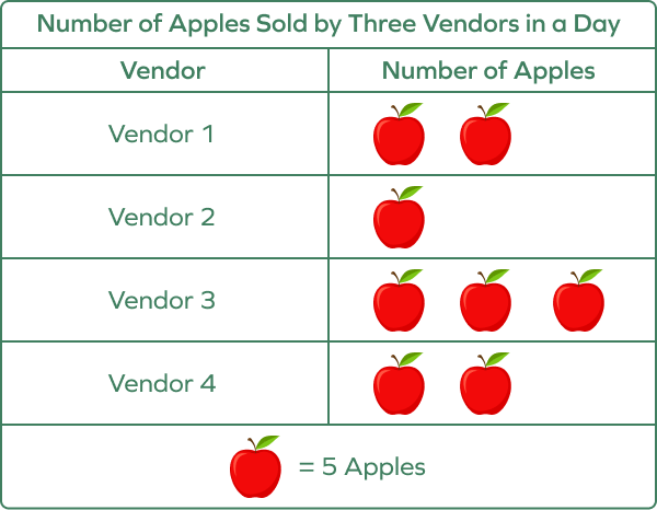
Picture graph example: If the data is about the number of apples sold by different vendors, each picture or symbol in the graph may represent a fixed number of apples.
Recommended Games


Pictograph: Definition
A picture graph or a pictograph is a visual representation used to represent data using pictures, symbols, icons, etc., displaying a given numerical or categorical information in a more visually attractive and accessible way.


Different Parts of a Pictograph
- Title: The title describes the main topic, theme, or subject of the graph.
- Categories: Categories tell us about the type of data or different items. Categories are the distinct groups or labels that the data is organized into.
- Symbols: In pictographs, data points are represented by symbols, icons, or pictures. Each symbol typically corresponds to a specific quantity or value.
- Key/Legend: The key or legend provides a reference for interpreting the symbols used in the graph. It explains what each symbol represents and helps viewers understand the data accurately.
- Scale: The scale of a pictograph is the number that each symbol represents.
- Labels: Labels provide additional information and context for the graph. They may include titles for the axes, labels for the data points, and any other relevant information.
These different parts work together to visually represent data in a picture graph, making it easier to understand and interpret the information being conveyed.
Let’s understand the different parts of a picture graph through examples.
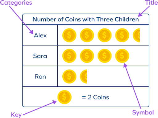
Example 1: The given pictograph shows information about the number of coins with three kids, Alex, Sara, and Ron. The graph uses the symbol of a dollar coin. The key states that each symbol represents 2 coins. That’s your scale.
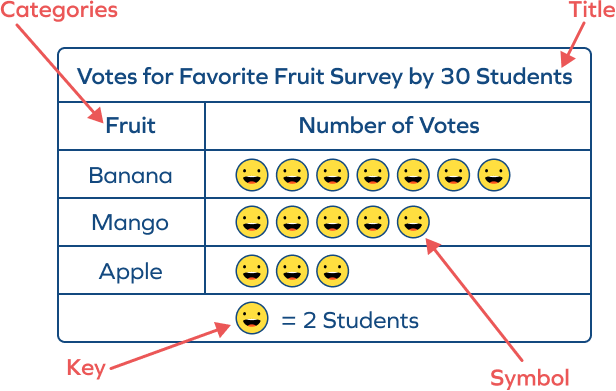
Example 2: This picture graph shows the favorite fruits of 30 students from a survey. One emoji symbol represents 2 students. It means that the scale of the pictograph is 2.
Key of a Pictograph
- A pictograph key serves as a guide for interpreting a pictograph’s symbols or pictures.
- It provides descriptions of the symbols used and their corresponding values or meanings.
- The key helps the reader understand the data representation and interpret the information accurately.
- The key adds clarity and context to the pictograph by associating symbols with specific quantities or categories.
How to Read and Interpret a Pictograph
- Learn the theme: Understand the type of the data by reading the title.
- Learn the key and scale: Note down the provided key in the pictograph to grasp the scale or what each symbol represents.
- Find the Data Values: Count the symbols in each category to determine the frequency or quantity of each data point. Calculate the data values or the real quantity by multiplying the number of symbols in a category by the scale value.
A simple formula can be used to calculate the value of the data in the categories.
Value of a category = N × S
Here, N is the number of times, and S is the value of each symbol.
- Analyze: Extract specific information from the pictograph, such as identifying the most common or least common category or comparing quantities between categories. Analyze the data and offer insights or observations about the represented dataset.
- Conclusion: Draw conclusions and make inferences based on the information shown in the pictograph.
Note that a key is mentioned along with the picture graph to indicate what each symbol/image represents. The key of a pictograph is a section that explains the symbols used in the graph. It associates each symbol with its corresponding value or category. It helps viewers understand and interpret the data accurately.
Let’s discuss examples.
Example 1: Take a look at the given pictograph.
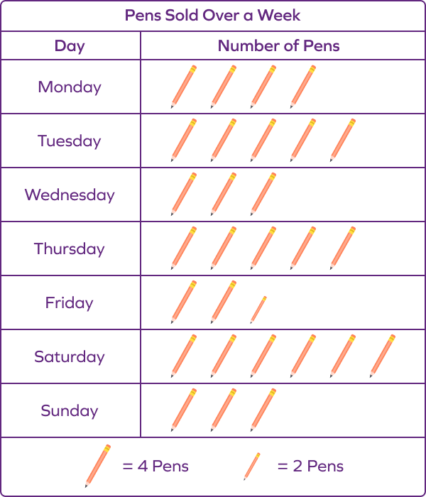
The key shows that 1 symbol shows 4 pens were sold, which means that the scale of the pictograph is 4. A scale implies the number of objects shown by 1 symbol or picture on the graph. The key also shows a symbol that represents 2 pens.
- Monday: There are 4 pen symbols shown for Monday. As each symbol represents 4 pens, that means, on Monday, 4 × 4 = 16 pens were sold.
- Tuesday: 5 × 4 = 20 pens
- Wednesday: 3 × 4 = 12 pens
- Thursday: 5 × 4 = 20 pens
- Friday: 2 symbols represent 8 pens and half a symbol represents 2 pens. Therefore, pens sold on Friday = 8 + 2 = 10 pens.
- Saturday: 6 × 4 = 24 pens
- Sunday: 3 × 4 = 12 pens
Example 2: Let us consider a pictograph representing the number of books read by four students in a class over a month.
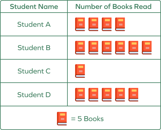
Each book symbol represents 5 books.
The categories are names of students.
- Student A read 5 × 4 = 20 books
- Student B read 5 × 6 = 30 books
- Student C read 5 × 1 = 5 books
- Student D read 5 × 5 = 25 books
- Student B read the highest number of books
- Student C read the least number of books
How to Draw a Pictograph
Here are steps you can use to draw a pictograph:
- Topic and Symbols: Understand the topic or dataset and use appropriate pictures or symbols to represent the information visually.
- Categories: Identify categories or groups within your dataset, like students’ favorite fruits (e.g., apple, banana, orange).
- Key: Determine a suitable key or scale to represent the quantity associated with each symbol. Observe the given data to decide the suitable key. Assign data values to each category using the key. You can also draw symbols in fractions if a particular frequency is not a whole number.
- Construction: Draw the pictograph arranging symbols based on the dataset and decided scale.
- Labels: Label the horizontal and vertical axes of the chart with appropriate titles and units.
- Title: Include a descriptive title for the pictograph, reflecting the given data or topic.
Remember to use symbols and icons of the same size when making a pictograph. You can also show data by using only a part of an icon.
Apart from reading a picture graph, it is important to learn how to draw a picture of a graph. They should be able to differentiate between all the parts of a picture graph and understand their relation to each other. Let’s see how to draw a picture graph with examples.
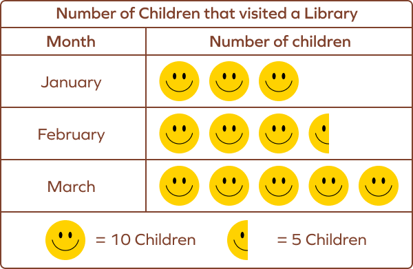
Example 1: The data given shows the number of children who visited a library in January, February, and March.
| Month | Number of Children |
|---|---|
| January | 40 |
| February | 35 |
| March | 50 |
To represent this data on a pictograph, follow the given steps:
- Think of a picture or a symbol to represent the number of children.
- Then, decide on a suitable scale. On a scale of 10, each symbol or picture would represent 10 children.
- Mention the key (the scale used).
Here, in two categories, the number of children is a multiple of 10. Taking a scale of 10 is convenient. To represent 35, we can use 3 complete symbols and one half.
We draw the picture graph as:
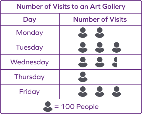
Example 2: Draw a pictograph chart representing the number of visits to an art gallery in 5 days.
| Day | Number of Visits |
|---|---|
| Monday | 200 |
| Tuesday | 300 |
| Wednesday | 250 |
| Thursday | 100 |
| Friday | 300 |
Here,
Title: Number of Visits to an Art Gallery
Let’s define the key as:
One symbol = 100 people
Use a half symbol to represent 50 people.
Pictograph:
Benefits of Using Pictographs
- A picture graph uses symbols and pictures to represent data. It is an efficient way to present data and numerical information for young children.
- The visuals allow children to make sense of the information clearly and understand its meaning.
- Picture graphs are especially useful for visual learners as they provide a clear and intuitive way to understand and interpret data.
- They can be used in various contexts, such as in classrooms to teach data analysis and interpretation or in real-life situations to represent information in a visually appealing and accessible manner.
- They help children connect objects with numbers, making it easier to understand quantitative relationships.
- Picture graphs make information more engaging and accessible for children, enhancing their understanding and retention.
- Picture graphs offer a unique and entertaining way to present data, keeping children interested and motivated in learning.
Some Limitations of a Picture Graph
- Pictographs are less precise with large numbers, as parts of a symbol don’t convey exact data.
- Best suited for data involving mainly whole numbers.
- It is not very useful for large datasets with fractional values.
- It is effective for simple data, but complex datasets might need other charts or graphs for accurate representation.
Picture Graph vs. Pictograph
Pre-K and kindergarten students are often introduced to graphs using different pictures for each category. It has a one-to-one representation of a key. For example, 4 apples are represented by 4 images of an apple, 2 bananas are represented by 2 images of a banana, etc. Such a graph that uses actual images to represent an item is termed a picture graph.
On the other hand, a pictograph is considered a graph that uses a symbol and a scale to represent an item. However, this small difference is often neglected. All graphs with symbols or images are called picture graphs, pictographs, pictograms, or icon charts.
In summary, picture graphs and pictographs use images or symbols to represent items visually, making them engaging tools for young learners to understand data representation.
Facts about Pictographs
- A picture graph is also known as a pictograph or pictogram.
- They are also commonly used in various real-world applications, including marketing, advertising, and media, to present information in a visually appealing and easily understandable format.
- Pictographs can effectively convey complex information using simple and easily understandable visuals. Pictographs are useful for representing data to young children and individuals with limited literacy skills, making information accessible to diverse audiences.
- Pictographs are one of the oldest forms of data visualization, dating back to ancient civilizations like the Egyptians and Sumerians.
Conclusion
In this article, we learned about pictographs, which are powerful tools for visually representing data using pictures or symbols. Pictographs offer an engaging and accessible way to present information, making complex data easier to understand. For better comprehension, let’s solve some Picture graph examples and practice some MCQs.
Solved Examples on Pictographs
1. Observe the picture graph representing the number of cakes sold by a bakery. How many cakes were sold by the bakery in three months?
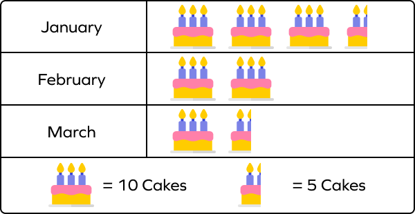
Solution:
The pictograph uses the symbol of a cake to represent the number of cakes sold.
From the given key, we have
1 whole symbol of a cake represents 10 cakes.
Half a symbol of a cake represents 5 cakes.
January: 3 whole cakes and a half cake
Number of cakes sold = (3 × 10) + (1 × 5) = 30 + 5 = 35 cakes
February: 2 whole cakes
Number of cakes sold = (2 × 10) = 20 cakes
March: 1 whole cake and a half cake
Number of cakes sold = (1 × 10) + (1 × 5) = 10 + 5 = 15 cakes
Total number of cakes sold over three months = 35 + 20 + 15 = 70 cakes
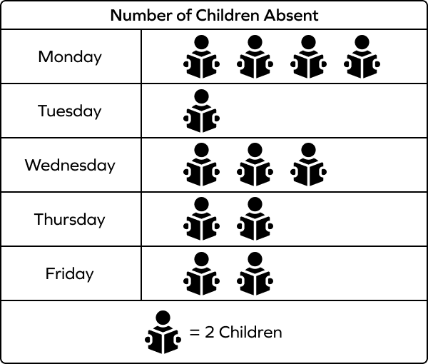
2. Draw a picture graph to represent the following information.
| Day | Number of Children Absent in a Class |
|---|---|
| Monday | 8 |
| Tuesday | 2 |
| Wednesday | 6 |
| Thursday | 4 |
| Friday | 4 |
Solution:
Here, we can choose the key as 1 symbol = 2 kids.
It will be easy to use since the given quantities or given numbers are all multiples of 2.
Here’s a picture graph representing the number of students absent in the classroom for a week.
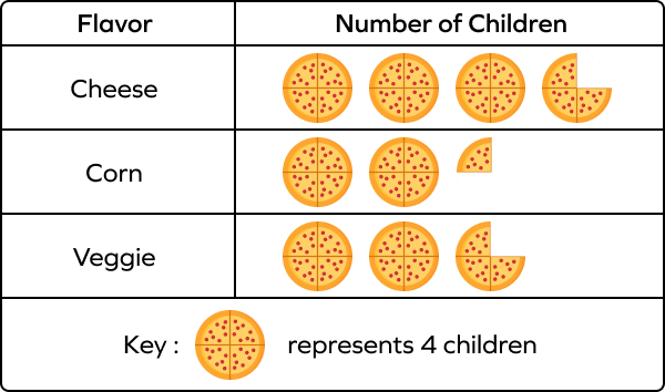
3. Make a pictograph representing the number of votes each flavor of pizza received from children.
| Flavor of Pizza | Number of Children |
|---|---|
| Cheese | 15 |
| Corn | 9 |
| Veggie | 11 |
Solution:
Choose the key as
1 Pizza symbol = 4 children.
1 slice = 1 child
2 slices = 3 children
3 slices = 3 children
4. The following pictograph represents the number of fruits sold in a day by a fruit shop. Determine the total number of fruits sold by the shop.
Key: Each Mango icon represents ten fruits
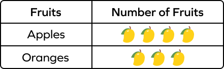
Solution:
Each Mango icon represents 10 fruits.
Number of apples sold = 3 × 10 = 30
Number of oranges sold = 4 × 10 = 40
Therefore, the shop sold 30 apples and 40 oranges, which makes a total of 70 fruits.
5. The pictograph below depicts the number of cars in a parking lot at various times of the day. Tell the total number of cars parked on that day if 1 car icon = 5 cars.
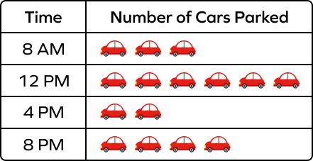
Solution:
Each car icon indicates five vehicles.
Through this pictograph, we can determine that-
Number of cars parked at
8 AM = 3 × 5 = 15 cars
12 PM = 6 × 5 = 30 cars
4 PM = 2 × 5 = 10 cars
8 PM = 4 × 5 = 20 cars
Therefore, there were a total of 75 cars parked in the parking lot on that day.
6. Draw a pictogram to represent the number of dogs that belong to four families.
| Family | Number of Dogs |
|---|---|
| Family A | 6 |
| Family B | 4 |
| Family C | 10 |
| Family D | 2 |
Solution:
Let’s choose a Dog image to represent the data.
Let’s take one symbol = 2 dogs
Pictograph of Number of Dogs Owned by Four Families:
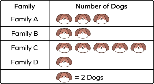
Through this pictograph, we can determine that-
Pet owned by Family A = 3 × 2 = 6
Pet owned by Family B = 2 × 2 = 4
Pet owned by Family C = 5 × 2 = 10
Pet owned by Family D = 1 × 2 = 2
Practice Problems on Pictographs
Picture Graph in Math - Definition, Facts, Examples, FAQs
In a picture graph, one symbol represents 10 people. What quantity do two-and-a-half symbols represent?
1 symbol: 10 people
2 symbols: 20 people
Half symbol: 5 people
Two and a half symbol: $20 + 5 = 25$ people
What is the total rainfall on Monday and Tuesday if one drop represents 4 inches of rainfall?
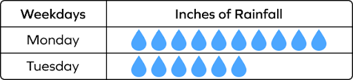
1 drop represents 4 inches of rainfall.
Number of symbols for Monday $= 10$
Total rainfall on Monday $= 10 \times 4 = 40$ inches
Number of symbols for Tuesday $= 6$
Total rainfall on Tuesday $= 6 \times 4 = 24$ inches
Total rainfall on Monday and Tuesday $= 40 + 24 = 64$ inches
The following picture graph shows the attendance of a class for a week. Determine the number of students present on Wednesday.
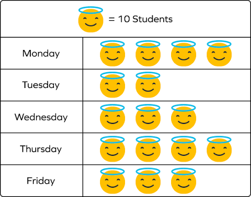
Wednesday's row shows three figures, each representing 10 students, making the total number of students 30.
How are categories represented in a pictograph?
Symbols or pictures represent different values assigned to categories.
What does the key in a pictograph do?
The key in a pictograph describes the symbols and their meanings.
What does the scale in a pictograph tell you?
The scale is the value represented by each symbol.
A pictograph shows how many cars were sold at a dealership. Each car symbol indicates 10 vehicles. How many cars were sold on Monday if the pictograph shows ‘three and a half’ symbols for the day?
3 symbols: $3 \times 10 = 30$ cars sold
Half symbol: 5 cars sold
Total number of cars: $30 + 5 = 35$ cars
Frequently Asked Questions about Picture Graphs
What are the important elements of a picture graph?
The important elements of a picture graph are scale/key, axes/columns, and a title.
Is there a difference between picture and bar graphs?
A picture graph represents numbers using symbols/images, whereas a bar graph uses bars.
What are some other kinds of graphs used in mathematics?
Other kinds of graphs used in mathematics are bar graphs, area charts, pie charts, histograms, etc.
Is the scale and key the same thing in picture graphs?
Yes, both scale and key are the same in a picture graph.
Why do we use pictographs?
A pictograph is a visual representation of data or information that is easy to understand and clear. It helps in the swift exchange of information, making numerical or categorical data simpler to understand and analyze using visual symbols or pictures. A pictograph is best used to deliver data or information in a visually appealing and easily accessible style. It is useful for communicating numerical or categorical data, comparing quantities or categories, and offering a fast summary of the information depicted.
What are other names for pictographs?
Other names for pictographs are picture graphs, pictograms, and icon charts.
What types of data are best suited for pictographs?
Pictographs work well for showing categorical data or data that can be counted.