Have you ever observed how you can look at a map and it will tell you the exact location of a place? What would you do if you did not have a map? Well, you might have to fly high above the ground and see which way leads to your destination! But you don’t have to. Do you see how a builder takes the blueprint of a house and turns it into a real thing?
All of this is possible because of the mathematical concept of the scale factor. The scale factor can be described as a parameter that is used to enlarge or reduce the sizes of shapes in two-dimensional and three-dimensional geometry. It can be used to create similar figures but with different dimensions.
What is a Scale Factor?
A scale factor is defined as the ratio between the scale of a given original object and a new object, which is its representation but of a different size (bigger or smaller).
For example, if we have a rectangle of sides 2 cm and 4 cm, we can enlarge it by multiplying each side by a number, say 2. The new figure we get will be similar to the original figure, but all its dimensions will be twice that of the original rectangle. Here, the number 2 will be called the scale factor.
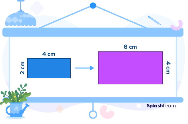
Note that the scale factor only changes the dimension or side lengths of shapes but does not change the angle measures.
Recommended Games
How Does the Scale Factor Work?
When describing enlargement, it is necessary to mention how much the shape has been enlarged. For example, scale factor 3 means that the new shape is thrice the size of the original shape.
If the scale factor is a fraction, the shape will be smaller. This is called reduction. Therefore, a 1/2 scaling factor means that the new shape is half of the original shape.
Recommended Worksheets
How Do You Find the Scale Factor?
The scale factor can be figured out by specifying the new and original dimensions.
- Scale Factor $=$ Dimension of New Shape/Dimension of Original Shape
However, there are two terms you need to understand when using scaling factors: scaling up and scaling down. Look at the figures below to understand this better.
Scale Up
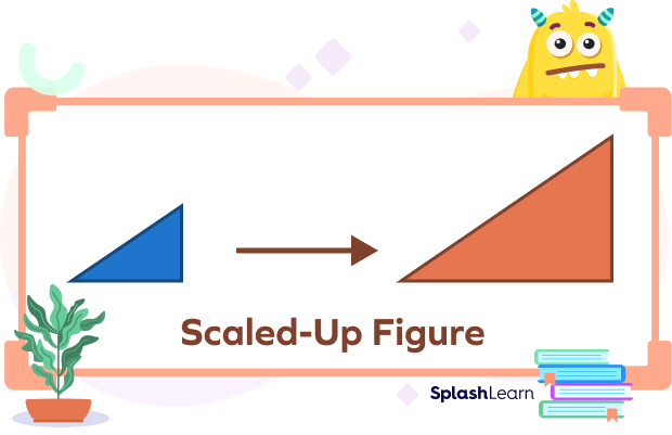
Scale up means enlarging a small shape into a large one. The scale factor for upscaling is always greater than 1.
Scale Down
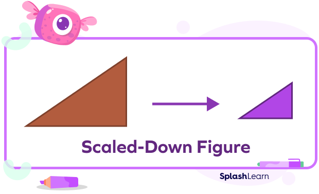
Scale down means that a large number is reduced to a small number. The scale factor for scaling down is always less than 1.
Uses of the Scale Factor
Scaling objects is a great way to visualize large real-world objects in a small space or magnify small objects to make them easier to see!
The scale factor is used to do the following:
- Draw a similar figure in geometry.
- Create a scale model.
- Create blueprints and scale plans for machinery and architecture.
- Shrink vast lands into small pieces of paper, like a map.
- Help architects, machine-makers, and designers work with models of objects that are too large to hold if they are their actual size.
Scale on a Graph
Let’s learn about ‘scale’ on a graph and some important related terms.
Data
Data is the collected facts. We often need to find things such as:
- The population of a town
- Number of students in a school
- Sales of a particular product during a week
- Likings of people, etc
In such cases, we collect data. We read and interpret the collected data to make sense of it. One of the ways of showing the processed data is through graphs.
A graph is a visual representation of data.
Some common graphs are:
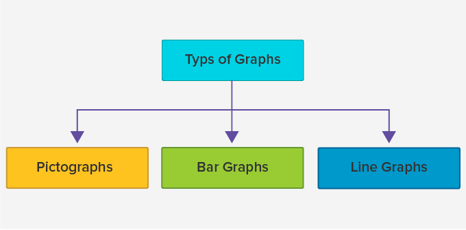
We use a scale to measure or quantify objects. Let us understand what a scale is with the help of a pictograph.
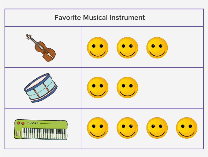
The above pictograph shows the information for the favorite musical instrument of children. Can you tell how many children like Guitar or Drum or Keyboard?

What does 1 symbol represent?
Well, it can be of any value. But unless and until we don’t show it on the graph, we won’t be able to tell the exact number of people. In such cases, we use a scale.
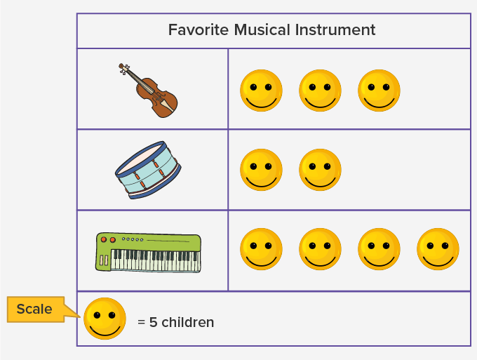
Now, we know, 1 represents 5 children. So, now we can say, 15 children like guitar, 10 like the drum and 20 like the keyboard.
Scale
In simple words, a scale is a set of numbers that help to measure or quantify objects. A scale on the graph shows the way the numbers or pictures are used in data.
Let us now move on to a bar graph. We use the same data of “Favourite Musical Instrument” to plot a Bar graph.
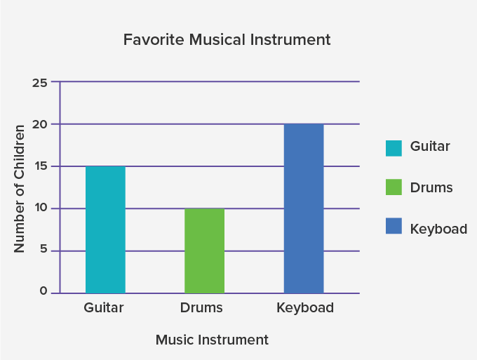
- Here, the vertical axis (y − axis) shows the number of children and the horizontal axis (x − axis) shows the musical instruments.
- On the y-axis, the numbers are marked at intervals of 5. This indicates that the scale used for the graph is 1 unit is 5 children.
The distance between two numbers indicates a unit and this unit remains uniform throughout a scale. Thus, a scale plays a crucial part in plotting graphs. Without scales, we won’t be able to infer anything relevant from the graph.
Fun Fact
- A scale on a graph can have any unit as required to solve the problem.
Solved Examples on Scale
Example 1. Find the scale factor when a square of side 4 cm is enlarged to make a square of side 8 cm.
Solution: The formula for scale factor is:
Scale Factor $=$ Dimensions of New Shape/Dimension of Original Shape
Therefore, the scale factor for the given enlargement is
Scale Factor $= 8/4$
Scale Factor $= 2$
Hence, the square has been enlarged by a scale factor of 2.
Example 2. A triangle with side lengths of 3 cm, 4 cm, and 5 cm has been enlarged by a scale factor of 4. What are the dimensions of the new triangle?
Solution:
Dimensions of the new shape $=$ Scale factor $\times$ Dimensions of original shape
Therefore, the dimensions of the new triangle will be 4 times the original.
So, the new dimensions are 12 cm, 16 cm, and 20 cm.
Example 3. If a circle of radius 3 cm was reduced to a circle of radius 1 cm, what is the scale factor for this reduction?
Solution: We know that,
Scale Factor = Dimension of new shape/Dimension of original shape
Radius of original circle $= 3$ cm
Radius of new circle $= 1$ cm
So, the scale factor for this reduction $= 1/3$
Practice Problems on Scale
What is a Scale Factor - Definition With Examples
If a cube of edge length 12 cm is enlarged to create a cube of edge length 36 cm. What is the scale factor?
Scale Factor = Dimension of New Shape/Dimension of Original Shape
Edge length of original cube = 12 cm,
Edge length of new cube = 36 cm.
So, the scale factor for this enlargement = 3
If a sphere of radius 20 cm is reduced to create a sphere of radius 5 cm, what is the scale factor for this reduction?
We know that Scale Factor = Dimension of new shape/Dimension of original shape Radius of original sphere = 20 cm, Radius of new sphere = 5 cm. So, the scale factor for this reduction = $\frac{20}{5}$ = 4 cm
If a square of side 5 cm is enlarged by a scale factor 2, what are the dimensions of the new square?
Dimensions of new shape= Scale factor ✕ Dimensions of original shape
Therefore, the dimensions of the new square will be 2 times the original.
So, the side of the new square will be 10 cm.
If a cuboid of dimensions 6 cm, 9 cm, and 12 cm is reduced by a scale factor of $\frac{1}{3}$, what will be its new dimensions?
We know that,
Dimensions of new shape= Scale factor ✕ Dimensions of original shape
Therefore, the dimensions of the new cuboid will be $\frac{1}{3}$ times the original.
So, the dimensions of the new cuboid will be 2cm, 3 cm, 4 cm.
Frequently Asked Questions on Scale
How is a scale factor calculated?
The formula for calculating the scale factor is:
Scale Factor $=$ Dimensions of new shape/Dimension of original shape
How can we use the scale factor in real-life situations?
The scale factor can be used in the following ways:
- To compare two 2D/3D geometric figures
- To calculate ratios and proportions
- To measure drawings of the same shape but with different dimensions
- To transform the sizes in engineering and architectural fields
What is a scale drawing?
A scale drawing is an exact drawing of the object created using the scale factor to reduce or increase the dimensions of the original object.


