What is a Bar Graph?
A bar graph can be defined as a graphical representation of data, quantities, or numbers using bars or strips. They are used to compare and contrast different types of data, frequencies, or other measures of distinct categories of data. For example,

The above graph shows how many students like which season. The seasons are listed as spring, summer, fall, or winter on the bottom horizontal axis of the graph. The number of students is written on the vertical axis as 0, 1, 2…
Recommended Games


Elements of a Bar Graph
Bars
The rectangles drawn on the bar charts are called “bars”. The bars display the number of items under particular categories.
Axes
There are two axes present on the graph. One axis is used to represent the numerical values whereas the other represents the categorical data against which the numerical data is plotted.
In the same example,

The seasons on the x-axis represent the categorical data and the number of students on the y-axis represents the numerical possible values. And the blue bars represent the number of students pertaining to each category or season.


Properties of Bar Graph
- A bar graph is the representation of numerical data by rectangles (or bars) of equal width and varying height.
- The gap between one bar and another should be uniform throughout.
- It can be either horizontal or vertical.
- The height or length of each bar relates directly to its value.
Types of Bar Graph
Horizontal: Here, the bars are drawn horizontally from left to right. The data categories are placed on the vertical axis and numerical values are placed on the graph’s horizontal axis.

Vertical: Here, the bars are drawn vertically from down to top. The data categories are placed on the horizontal axis, and the numerical values are placed on the graph’s vertical axis.

Grouped: This graph represents related sets of data. Each set of data is graphed separately but on the same graph. The key explains which set of data is shown by the graph.

For example, in the above graph, the blue bar represents the number of students in Class A that prefer a particular fruit, the orange bar represents the number of students in Class B, and the green bar represents the number of students in Class C that prefer a particular fruit.
How to make a Bar Graph?
Let’s try representing the given data on a graph.
| School Supplies Students Use | ||||
| Pencil | Scale | Pen | Sharpener | Eraser |
| 8 | 3 | 2 | 5 | 4 |
Step 1: Decide the scale and interval for your numerical values. The scale refers to the counting sequence we will place on the axis. For smaller values, we simply go with the counting sequence 1, 2, 3… but for larger values, we can also pick a counting sequence with some interval of numbers between each value. For example, 5, 10, 15…
Step 2: Label the horizontal and vertical axes to describe the information.
Here, we are drawing a vertical bar graph, so we will place the categorical data on the x-axis and the numerical values on the y-axis.
Step 3: Draw bars corresponding to each category. For example, since there are 8 pencils, draw a rectangle over the “pencil category” with the length of the rectangle as 8 units. Similarly, draw other bars corresponding to each category with the same breadth as the first bar.
Step 4: Label the graph with a title.

Solved Examples on Bar Graph
Example 1: Draw the horizontal bar graph for the given data set between the number of people and their preferred beverage.
| Preferred Beverages | ||||
| Water | Tea | Coffee | Orange Juice | Lemon Juice |
| 45 | 25 | 30 | 25 | 40 |
Solution:

Example 2: Create a bar graph for the given data set.
| T-Shirt Sale During a Week | ||||||
| Monday | Tuesday | Wednesday | Thursday | Friday | Saturday | Sunday |
| 10 | 25 | 30 | 40 | 55 | 60 | 20 |
Solution:

Example 3: Draw a bar graph for the given data set.
| Favorite Colors | ||
| Color | Girls | Boys |
| Red | 10 | 15 |
| Blue | 12 | 11 |
| Pink | 7 | 7 |
| Green | 15 | 13 |
| Brown | 6 | 4 |
Solution:

Example 4: Read the following graph and answer the questions.

- Which is the most popular club?
- How many more students than the math club does the science club have?
- How many students are in the sports club?
- Find the total number of students in the clubs.
Solution:
- The movie club is the most popular club.
- Number of students in Science Club $= 21$
Number of students in Math Club $= 15$
$21$ $–$ $15 = 6$
So, 6 more students are in the science club than in the math club.
21 students are in the sports club
Total number of students $= 15 + 21 + 16 + 25 + 23 = 100$
Practice Problems on Bar Graph
Bar Graph - Definition with Examples
Use the given graph to find out the topping most liked by the students.
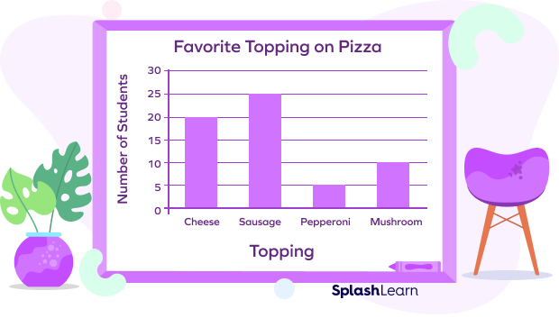
The bar of sausage is the tallest bar in the given graph, which is reaching the line that says 25.
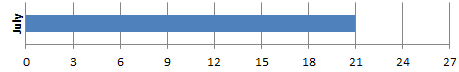
The given graph shows the data about the sale of the dresses over four months. One bar is missing from the graph. If 78 dresses are sold in these four months, which bar shows the number of dresses sold in July?
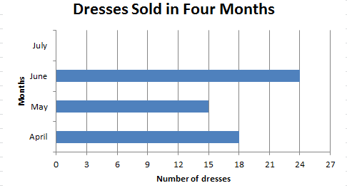

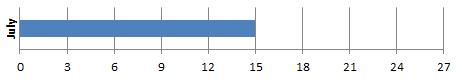
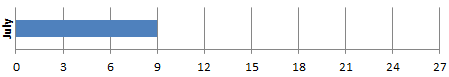
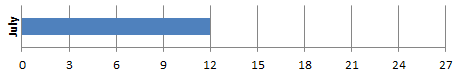
Total dresses $= 78$
number of dresses sold in July $= 78$ $–$ $(18 + 15 + 24) = 78$ $–$ $57 = 21$
Which sport is liked by the least number of people?
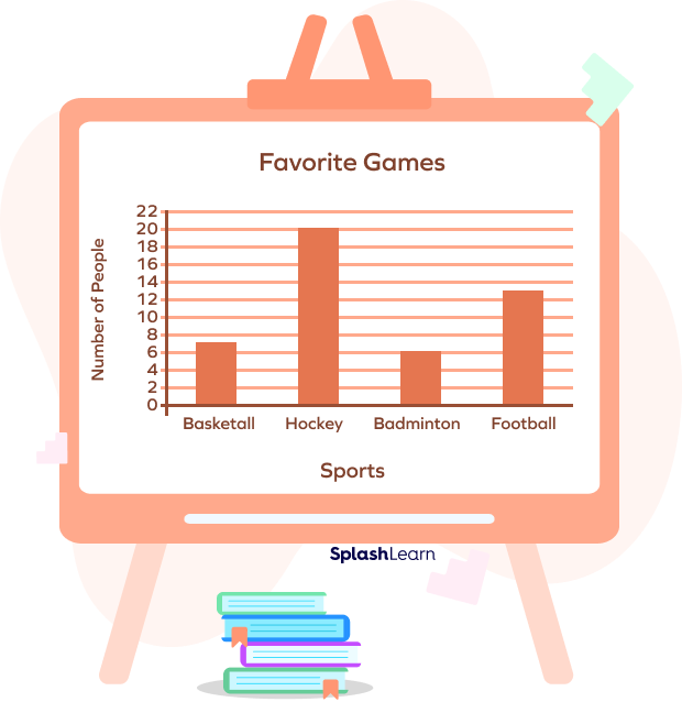
Badminton is liked by the least number of people.
The average marks scored by four different classes of boys and girls are shown in the given graph. What is the average score of Class C?
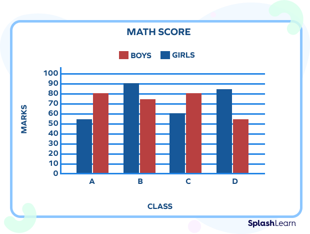
Average score $= \frac{60+ 80}{2} = 70$
Frequently Asked Questions on Bar Graph
Why do we need to learn data representation?
Data representation gives a clear idea of what the information means by giving it visual context through graphs. It makes the data easy to understand.
What is the advantage of a bar graph?
It represents the data set in a visual form, which helps to observe and analyze the data easily.
What are some other types of pictorial charts?
- Line chart
- Pie chart
- Histogram, etc.
Why are titles and labels necessary in a bar graph?
The title and labels give information about the number of items under certain categories which is essential for reading the graph.