What is a Horizontal Bar Graph?
A horizontal bar graph displays the information using horizontal bars. It helps us to visualize and compare data for different categories.
A bar graph is a graph with rectangular bars with lengths and heights proportional to the values that they represent. The advantage of bar graphs is they are easy to read and understand. They instantly give you an idea about the given data set.
Horizontal bar graphs represent the data horizontally. These are sideways bar graphs whose bars are drawn horizontally.
Recommended Games


Parts of a Horizontal Bar Graph
A horizontal bar graph is a bar graph drawn with rectangular bars of lengths proportional to the values that they represent.
- On the y-axis of the graph, it shows the data categories that are being compared.
- The x-axis represents the values corresponding to each data category.
Let’s see examples of horizontal bar graphs to understand this.
Example 1: A horizontal bar graph of the favorite color of 50 students is shown below. On the y-axis, you can see the data categories (different colors). On the x-axis, you can see the data values (number of students).

Example 2: In the given horizontal bar graph, we can infer that 1 unit represents 5 students on the scale. We can see that 10 students like red, 5 like yellow, 20 like blue, and 15 like green.
The data categories are shown on the vertical axis, while the values or frequencies are represented on the horizontal axis. The length of each bar is equal to the value corresponding to the data category, and all bars go across from left to right horizontally on a graph.
For example, in the graph below, the vertical axis shows us the seasons, and the horizontal axis shows us the temperature data for each season.

The horizontal axis represents the numerical values, while the vertical axis represents different categories.


Scale of Horizontal Bar Graphs
The scale of a bar graph describes the relation between the unit length of the bar and the quantity it represents. The scale makes it easier to measure or quantify the given data.
For example: If the scale of a bar graph is 1 unit = 5 objects, then the bar having 2 units length represents 10 objects. This way, you don’t have to draw a 10 unit long bar to represent 10 objects.
Drawing Horizontal Bar Graphs
How do we draw or plot horizontal bar graphs? Let’s understand it.
Step 1: Draw the two axes of the graph—the vertical X-axis and the horizontal Y-axis.
Step 2: The category that has to be compared is represented on the Y-axis. The measure or quantity is represented by the X-axis.
Step 3: To draw the horizontal bar, plot the vertical X-axis and then the horizontal Y-axis up to the length that is proportional to the value.
Step 4: If there is more than one parameter for each category, you can use different colors.
Step 5: Add the category labels and title the graph. Give a scale for the graph.
Here is the data showing the number of children who visited a library during the first three months of a year.

To represent this data on a horizontal bar graph, use following steps:

So, taking a scale of 10, we get the graph as:

What Are the Types of Horizontal Bar Graphs?
The types of horizontal bar graphs are as follows:
1. Simple Horizontal Bar Graphs
In simple horizontal bar graphs, the categories are compared based on a single parameter. For example, you can compare the rainfall in different cities. However, you cannot compare the rainfall and the sunshine in different cities.
2. Double Horizontal Bar Graphs
In double horizontal bar graphs, you can compare different categories based on two parameters. For example, you can compare rainfall and sunshine in different cities.
3. Multiple Horizontal Bar Graphs
In multiple horizontal bar graphs, you can compare categories based on various parameters. For example, you can compare rainfall, sunshine, temperatures, and humidity across different cities.
The Benefits of Horizontal Bar Graphs
The benefits of horizontal bar graphs are that the categories are easier to view when you look at the chart. These bar graphs are also easier to view on smaller devices like phones.
Further, it is also easier to visualize and compare the data based on the bar length and the bar color. For example, in a graph about pollutant levels, the measure of a pollutant can be indicated by the length of the bars. The color of the bar can indicate whether the pollutant levels are hazardous or not.
Are Vertical or Horizontal Bar Graphs Better?
Vertical bar graph advantages include scope for longer bars since there is more space for them to fit on the page.
Horizontal bar graphs tend to be better for data with fewer categories or where the items being compared are very important.
What Are the Other Types of Bar Charts?
The other types of bar charts are:
- Stacked bar graphs
- Clustered bar graphs
- Percentage bar diagrams
Facts about Horizontal Bar Graph
- The title of the horizontal bar graph tells us about the data being represented by the graph. Horizontal bar graph is also known as a horizontal bar plot.
- The vertical axis represents the data categories. Here, the data categories are the colors.
- The horizontal axis represents the values corresponding to each data value. Here, the data values are the number of students who like a particular color represented on the vertical axis.
- The scale shows the value of 1 unit on the horizontal axis.
- The other type of bar graph is the vertical bar graph, where the data is represented through vertical bars.
The x-axis and the y-axis are switched in a vertical bar graph.

Conclusion
A horizontal bar graph helps us visualize and compare data for different categories or items. It brings the categories into focus and helps us visualize data with bars of different sizes and colors.
Solved Examples On Horizontal Bar Graph
1. The data of the number of visitors to a museum for four months is shown below. Draw a horizontal bar graph to display the same. Also, what type of horizontal bar graph would you draw?

Solution:
Since there is only one parameter (number of visitors), we would draw a simple bar graph.
We can choose the scale as 1 unit $= 50$ people

2. You want to compare different subjects based on the number of students who have taken the subject and the number of students who like the subject. What type of horizontal bar chart would you draw?
Solution:
We are comparing subjects based on two parameters.
- Number of students who have taken the subject.
- Number of students who like the subject.
Thus, we will draw a double horizontal bar chart.
3. If you want to compare different types of notebooks based on 1) the number of lines per page, 2) the number of pages, and 3) the number of sections, what type of horizontal bar graph would you draw?
Solution:
Since we are comparing the types of notebooks based on multiple parameters (the number of lines per page, the number of pages, and the number of sections), we would draw a multiple horizontal bar chart.
4. Based on the given horizontal bar chart, how many people in the survey wear medium-sized T-shirts? What is the scale?

Solution:
The scale is 1 unit $= 10$ people
The length of the bar corresponding to the medium size reads 20.
The number of people wearing medium size $= 20$.
5. In a class, 10 students play basketball, 15 students play football, and 5 students play tennis. Draw a horizontal bar chart to show this information.
Solution:
The number of students that play basketball $= 10$
The number of students that play football $= 15$
The number of students that play tennis $= 5$
Choose scale as 1 unit $= 5$ students

Practice Problems On Horizontal Bar Graph
Horizontal Bar Graph - Definition, Types, Parts, Examples
To compare different fruits based on the number of seeds they contain, what type of horizontal bar graph would you need to plot?
Since there is only one parameter (number of seeds), we would plot a simple horizontal bar chart.
Based on the given horizontal bar chart, how many students like the color green?
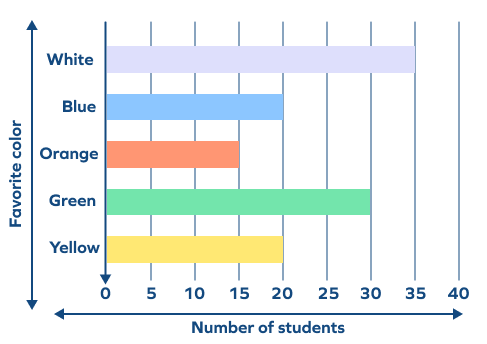
We can see that the value 30 on the horizontal axis corresponds with the bar for the green color on the vertical axis. We can thus infer that 30 students like the color green.
In a class, 6 students like chocolates, 11 students like cookies, and 12 students like cake. If you draw a horizontal bar chart to represent this, what value on the horizontal axis would correspond with the category of cookies?
The value corresponding with the category of cookies would be 11.
Based on the bar graph below, how many students passed the science exam?
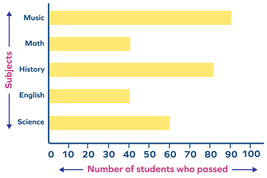
The value corresponding with the subject category Science is 60.
Frequently Asked Questions On Horizontal Bar Graph
What are different types of bar graphs?
- Vertical Bar Graph
- Horizontal Bar Graph
- Grouped Bar Graph
- Stacked Bar Graph
What are the different types of graphs?
Line graphs, bar graphs, pictographs, and pie charts are some of the different types of graphs.
What are labels in a horizontal bar chart?
Labels are the names of the different categories and parameters in a horizontal bar chart. They appear on the y-axis.
What is a scale in a horizontal bar chart?
A scale on the graph refers to a set of numbers that indicate intervals on a graph used for measurement. The distance between two numbers on a graph represents a unit, and this unit remains uniform throughout a scale.
Can we show percentages on a horizontal bar chart?
Yes, we can show percentages by representing their numerical value on the horizontal axis.